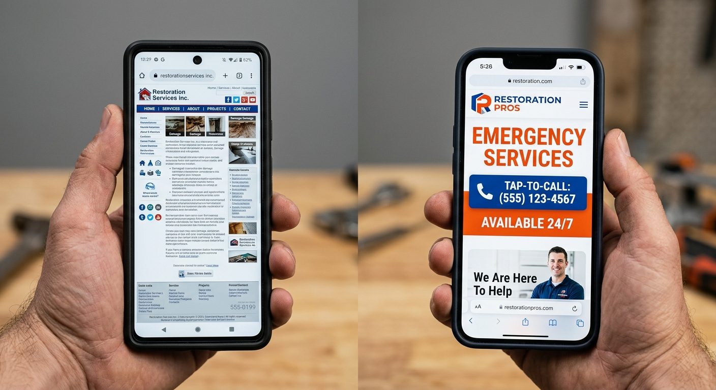
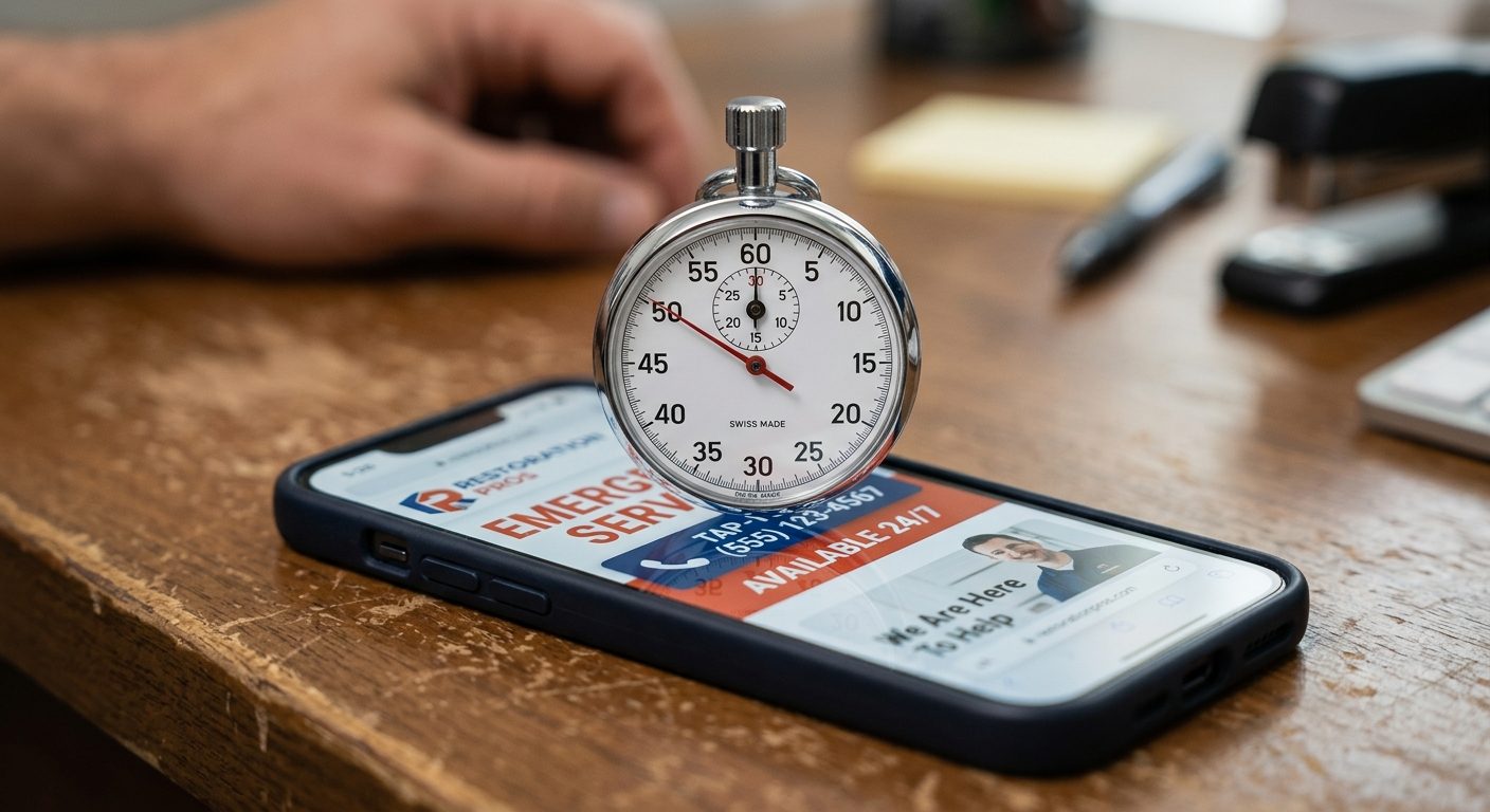
Set a timer for 10 seconds. Pull up a restoration company's website on a phone. Stop when the timer runs out. Could a stressed homeowner standing in a flooded kitchen tell, in that window, whether this company can help them right now and how to reach them? For most restoration websites, the honest answer is no.
That 10-second test is not a gimmick, it is roughly how long a real visitor spends deciding whether to stay or bounce to the next Google result. Passing it is not about better design. It is about ruthlessly cutting everything that does not answer three questions immediately.
The Three Questions That Decide Everything
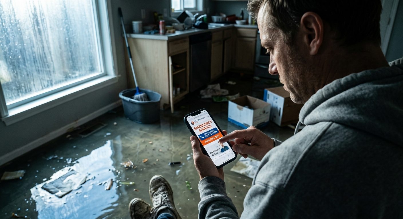
A homeowner in an active emergency is running a simple mental checklist: can this company help with my specific problem, are they available right now, and how do I reach them in the next 10 seconds. Every element on the homepage should serve one of those three questions. Anything that does not is, at best, neutral, and at worst, actively pushing the visitor toward a competitor's tab.
Failing Example: What Most Sites Actually Show
A typical restoration homepage opens with a wide hero photo of a smiling team, a headline like "Your Trusted Restoration Partner Since 2009," and a navigation bar with eight menu items. The phone number is in small gray text in the top corner. Nothing on the first screen mentions availability, response time, or service area.
This fails the test. None of it answers the three questions in the first 10 seconds. The visitor has to hunt for the phone number, guess whether the company covers their area, and infer availability from nothing at all.
Passing Example: What the First Screen Should Show
A homepage that passes opens with a headline stating the service and urgency directly, something like "24/7 Water Damage Response in Plano and Surrounding Areas." A tap-to-call phone number sits in the header in a color that visually separates it from everything else. A single sentence beneath the headline states average response time, for example "On-site within 60 minutes." One clear button repeats the call-to-action.
Nothing about this requires expensive design work. It requires deciding, deliberately, what the first screen exists to do and removing everything that competes with it.
Fixes Ranked by Impact
-
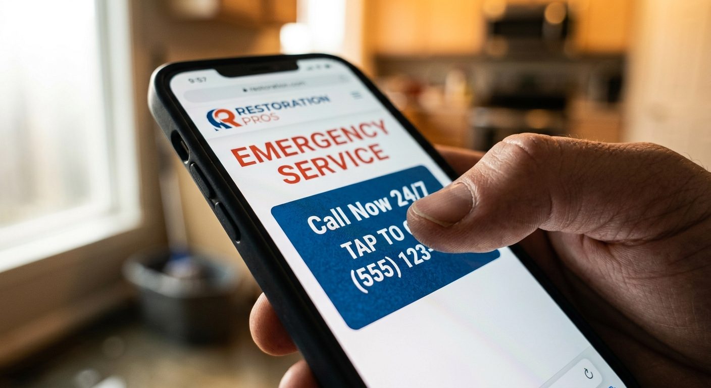
Move the phone number into the header as a tap-to-call link. This alone recovers mobile conversions lost to visitors who cannot find a number to tap.
-
State availability and response time above the fold. "Available 24/7" or "On-site within 60 minutes" needs to appear before any scrolling.
-
Name the service area explicitly in the headline or subhead. Generic copy that could apply to any city anywhere signals nothing to a homeowner deciding if this company covers their street.
-
Cut the navigation menu to essentials. Service, service areas, reviews, contact. An eight-item menu built for browsing is the wrong tool for a visitor trying to make an emergency decision in seconds.
-
Replace generic hero photography with real job photos. A real crew on a real job, even imperfectly lit, builds more trust in an emergency category than polished stock imagery.
A Quick Comparison
Redesigning a website without running this test first usually produces a site that looks better and converts the same. The test forces every decision back to what the visitor is actually trying to do in the first 10 seconds.
The Bottom Line
A restoration company website does not need to impress anyone. It needs to answer three questions faster than the competitor's site in the next tab. Run the 10-second test honestly, fix what fails it, and the rest of the design decisions become obvious.
Frequently asked questions
What is the 10-second test for restoration company websites?+
It is checking whether a homeowner, in the first 10 seconds on the homepage, can tell if the company handles their problem, is available now, and how to contact them immediately.
Why does phone number placement matter so much on restoration websites?+
Emergency-intent visitors are searching primarily on mobile and want to call immediately. A phone number that is not a visible, tappable link in the header creates unnecessary friction at the exact moment urgency is highest.
Should restoration company websites state response times?+
Yes. Specific claims like "on-site within 60 minutes" build more trust and urgency than vague language, and they directly answer the availability question visitors are trying to resolve quickly.
How many items should be in a restoration website's navigation menu?+
Four or fewer is ideal for the main navigation: services, service areas, reviews or trust signals, and contact. Extensive menus built for casual browsing work against emergency-intent visitors.
Do stock photos hurt conversion on restoration company websites?+
Generally yes. Homeowners in this category respond better to real job photos, even if less polished, because trust and legitimacy matter more than visual perfection in an emergency decision.
Tags
More from the blog

SEO Agency vs. Freelancer: What Small Businesses Should Actually Compare
Most small businesses compare SEO agencies and freelancers on price alone. Here is what actually separates them, and how to pick the right one for your stage.
Read →

How Much Does a Fractional COO Actually Cost in 2026? (US/UK/UAE/AU Breakdown)
Fractional COO pricing varies widely by model, market, and scope. Here is a real breakdown of what businesses actually pay in the US, UK, UAE, and Australia in 2026.
Read →
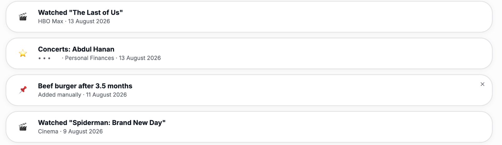
Faizan OS Week 3: A Milestone Feed and the First Privacy Bugs
Week three of building Faizan OS brought a curated milestone feed pulling from across the app, five new modules in two days, and the first bugs where real numbers showed up on screen when they should have stayed hidden.
Read →
Free operational audit
Want help building yours?
I structure and run offshore delivery teams for a living. Start with a free operational audit.